By Adam Cook, Caden Koscinski, Danny Ullrich
Why create a Network Visualizer?
The beginning of any project worth pursuing is clearly defining what your project should achieve. For our project, that goal was producing elegant, scalable network visualizations of any caliber. Furthermore, we intended to deliver that experience with an easily accessible data structure and intuitive user interface. Keeping those two proponents in mind, our team developed a user-driven experience designed to familiarize the common user with the versatility and usefulness of graph theory. With any piece of software or other computational product, the interface and experience is the product from the perspective of the user. Our network visualizer is important in the sense that it keeps this condition in mind, keeping the CSV data wrangling and HTML conversion in the background while the user is able to interact uninterrupted with the graph visualization. Additionally, graph theory is a relatively complicated concept in general, meaning that a clear UX helps to familiarize the user with the benefits of graph theory without the hassle of performing the necessary data conversion and code development required to produce a data network. While the website from the practical tutorial served the purpose of teaching users the concepts of graph theory, it did so using a myriad of unnecessary mathematical terms without giving the user concrete examples implementing said terms. This is where our data conversion is important, in the sense that the user can easily create and project their own graphs using only a limited knowledge of spreadsheet or text editors. By giving users the power to apply their own problems to the program, the usefulness of our project increases exponentially. Effectively, our project has achieved its desired goal of providing adaptable network visualizations.
Software Structure
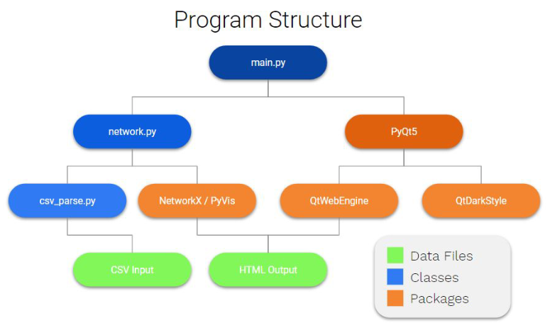
In the spirit of translating complex code interaction into more easily digestible terms, we have forgone a UML diagram in place of the program chart featured below:

The bulk of the technical prowess of the program comes from the NetworkX and PyVis combination. NetworkX is capable of building large data networks and visualizing them but they are static, this is where PyVis takes over by adding interactivity and a physics engine to NetworkX. PyVis is a python wrapper for the very powerful VisJS which is a Javascript web based visualization library. The GUI part of the project is powered by PyQt which is another python wrapper for the powerful Qt GUI system by the Qt company. PyQt allows for the bridge between python and the Qt gui which is written in C. Due to the language that Qt is written in it is extremely fast and lightweight.
Usage
It should be noted that a readme.md provided within the repository contains a condensed version of the installation process that will be detailed here. That readme.md also directs the user to use the provided shell script in order to automatically install any dependencies required by the user, which will also be detailed here.
Executing the Program
The first step to running our program requires the installation of all package dependencies. Assuming the user has completed the initial setup required to run any python code, including pip3, the program expects the user to use the command pip3 install in order to install each dependency. Once all of the dependencies have been successfully installed, the user must simply run python3 main.py in order to initiate the program. The user will be presented an empty window with tools for opening a file located in the top left corner. Selecting either Open Graph File or Open CSV File will prompt the user to locate a compatible file located within their local installation of the repository (directions for creating a compatible file are detailed below). The program will promptly display the chosen file and refocus the window to an appropriate size. After conducting whatever presentation and/or editing the user deems appropriate, the user may then select either Save Screenshot in order to save a static visualization of their graph or Save Graph in order to save a working copy of their existing graph to be opened at a later date.
Designing Files
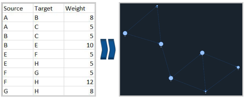
The intended file type anticipated by our program comes in the form of any .csv or .txt file. UTF-8 CSV files are encouraged as they are the most readable form of CSV without the need for code interpretation, but any format should work. The minimum requirement for producing a graph is the adherence to the Source - Target - Weight format for designing graphs on a row-by-row basis. Simply enter the origin node, the end node, and weight of the edge for each edge within the graph. An example of a singular row is shown below: A, B, 5 As we continue to update our program, additionally tools for graph creation can be employed within the file editor. The following are some examples of alternative data entry lines: A - Creates a disconnected node without any edges A, A - Creates a loop connecting a node to itself A, B - Defaults the line weight to the average of the graph

Examples of Practical Applications
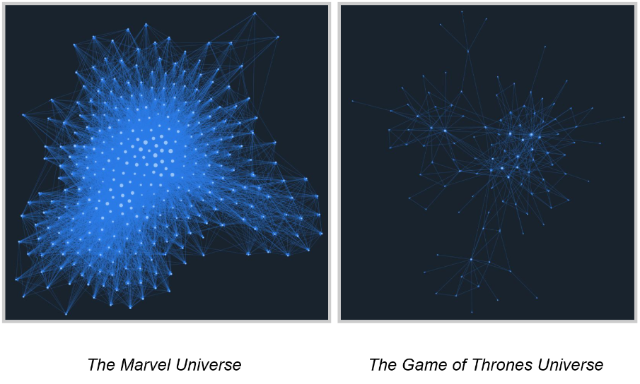
When dealing with extremely large sets of data, such as interpersonal connections or other highly interconnected sets of data, it is far more useful to interpret the graph from an “information density” perspective. The importance or level of dependency a node fulfills can be determined roughly by its location in relationship to other nodes and the rest of the graph. An example comparing graph interpretation based on density versus clearly defined connections can be seen below:

Challenges
A vast majority of the challenges our team encountered during the development of our application was related to the various packages we were using and their interactivity and/or documentation. Prototyping the NetworkX integration went very smooth and getting it to work with PyVis was painless however modifying the styling of PyVis to make the graphs attractive and more readable was a nightmare. Options are not explained anywhere and sometimes don’t work for no discernable reason. The GUI implementation was originally an issues as we started with the idea of using Tkinter which lacks a web engine all together. We later moved to WxWidgets to make use of the web engine that package has however it doesn’t support CSS or JavaScript which are a huge functional part of the PyVis graphing engine. WxWidgets also has a Web2 engine which does support CSS and JavaScript however there is no documentation on how to make use of it. Once the decision to switch to PyQt was made, development continued on smoothly.
Team Contributions:
The program can be split into three main parts; data importation, network creation and visualization, and GUI production. Caden Koscinski worked primarily on the data importation part of the program and worked to make the CSV to NetworkX database section of the pipeline work. Adam Cook and Danny Ullrich were responsible for the GUI creation and implementation of the PyVis interactivity engine for the NetworkX database.
Conclusion
In conclusion the resulting application is reflective of the original task we set out to do. The program is easy to use and is capable of producing beautiful interactive graphs. Collectively our team learned a lot about researching packages and planning before beginning development. It also taught us a lot about creating and working with GUI’s which is a useful and important skill for application development as a whole. Terminal based programs are great for some tasks but GUI’s are often required to increase usability and lower the skill required to use the program.
